The Looping Display Is Not a Complete Story
A looping display can make a rural notice easy to spot, but context takes more than repetition. Learn what a screen shows—and what it leaves out.
How can you tell whether a looping display gives people the full story or only a useful glimpse? A looping display can repeat a village hall announcement, a bus update or a photograph of a local event until someone notices it, but repetition does not supply missing context. The useful question is not how often a slide appears. It is whether a viewer can understand what it means, who it concerns and what to do next.
Use the checks below when you design a screen for a shop window, community space, waiting area or household. Each one helps separate a clear piece of information from an account that needs more than a few seconds on a screen.
1. Name the purpose
Start by deciding what the display is meant to do. A screen might announce a date, direct people to a room, introduce a longer story or show a reminder. Those are different tasks, and one slide should not quietly try to do all of them.
Write the viewer’s likely question in plain language. For a hall booking notice, it might be, “When is the meeting, and where do I go?” For a profile of a local craft group, the question may be, “What does the group do, and how can I learn more?” If you cannot state the question, the display’s purpose is not clear enough to guide its content.
Then decide what would count as a successful glimpse. A person passing the screen may only need to remember the meeting date. Someone being invited to understand a disagreement or a change to a shared service needs more than a headline. Treat the screen as a signpost if it cannot carry the full account.
2. Include the missing coordinates
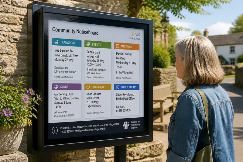
Information becomes hard to use when it lacks its basic coordinates: people, place, time and source. “Road closed” is not complete enough to guide a reader. Which road? From when? Is the message about a present closure or a planned one? Who issued the update?
For a short notice, make the essential details visible together. A village event slide could name the event, its date, the venue and an organiser or contact route. If the display cannot comfortably hold those details, show a short notice with a clear destination for the rest: a printed notice by the entrance, a named local office or a web page that residents can access.
Do not assume that viewers share the background knowledge of the person who made the slide. A familiar nickname for a field or building may be obvious to regulars and opaque to visitors, new residents or people viewing from another part of the community. Use the formal name or add a recognisable location cue.
3. Separate event from explanation
A headline can state what happened without explaining why it matters. “Footpath rerouted” gives an event; it does not say which route is affected, what prompted the change or where to find the alternative. A screen can make the first fact visible while directing viewers to a fuller explanation.
Keep those layers distinct. Put the immediate fact in the prominent message, then identify the fuller account as a separate source. Avoid a slide that uses a compressed phrase such as “new plans agreed” without naming what was agreed or who can clarify it. Such wording may sound complete because it is confident, while leaving the central question unanswered.
When the subject is disputed or sensitive, show the status of the information. A proposal, a decision and an action already under way are not interchangeable. Use the right word, and include the decision-making body or source where it helps people judge what they are seeing.
4. Give each image a job
A photograph can make a place recognisable, but it does not explain itself. A picture of a muddy lane might accompany a drainage update, a walking event or a request for help. Add a caption that says why the image is there and where it was taken, rather than relying on viewers to infer its meaning.
Check whether the image supports the text or substitutes for it. A photograph of a crowded room may suggest that a meeting was popular, but it cannot establish who attended, what was decided or whether the room was open to everyone. If the display tells a story, select images for a stated purpose: identifying a location, showing a change or introducing a person whose role is explained.
Also consider what a crop removes. A close view may hide a sign, a route or the people around the subject. If the framing changes what viewers could reasonably infer, choose another image or add a short clarification.
5. Make the loop legible
A viewer may arrive midway through a sequence and leave before it restarts. Each slide therefore needs enough identity to make sense on its own: a subject, a place or organisation, and a clear indication of whether the information is current. Avoid pronouns such as “it” or “they” when the previous slide is needed to identify what they mean.
Use a visible heading and a consistent source label, such as the name of the hall committee or the local service responsible for the notice. If content has an expiry point, state when it applies or arrange for it to be removed. A repeated outdated message can seem current simply because it is still being shown.
Keep transitions from interrupting comprehension. A viewer should have time to read a message without needing to catch a fast change or decode decorative motion. Where text is substantial, offer a longer-lived printed version or a route to a fuller account instead of shrinking the type until it fits.
6. Mark the edges of knowledge
A useful display distinguishes what is known from what remains uncertain. If a service time has not been confirmed, do not present it as settled. If an image is illustrative rather than a record of the event, say so. A brief label can stop a glimpse being mistaken for proof of a broader claim.
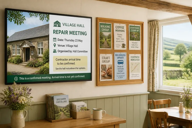
Say you are preparing a screen for a fictional village hall, and the date of a repair meeting is confirmed but the contractor’s arrival time is not. You could display the meeting date, venue and organiser, then state that the arrival time is still to be confirmed and point to the hall noticeboard for updates. Viewers would receive a usable announcement without being led to treat an unknown detail as settled.
Do not make uncertainty so vague that the message becomes useless. “More information soon” leaves people without a way to follow up. Name the source that will provide the update or the place where a revised notice will appear.
7. Ask what the screen cannot carry?
Does repetition make a message complete?
No. Repetition can make a short message easier to notice, but it cannot add facts the message omits. Check whether a viewer can identify the subject and the next action without waiting for another slide.
When should a screen point elsewhere?
Point elsewhere when people need a sequence of reasons, multiple voices, detailed instructions or background that will not fit legibly on screen. Name the destination clearly, and make sure it is accessible to the people expected to use it.
Can one image tell a whole community story?
Usually it can only show one view. Explain who or what appears in the image, what it represents and what it leaves outside the frame. If different experiences matter to the account, use a fuller format that can make room for them.
8. Check the message in place
Read the display from the position where someone will actually see it: a doorway, a counter or the far side of a shared room. Check that the heading is visible, the details are readable and the source is recognisable. Then ask someone unfamiliar with the notice to say what they think it means. Their interpretation can expose an assumption that was invisible to its author.
For a final edit, ask:
- Can a viewer identify the subject without seeing another slide?
- Are the place, date, status and source clear where they matter?
- Does each image have a caption that explains its role?
- Is an uncertain or illustrative detail labelled as such?
- Can a viewer find the fuller account or ask for clarification?
Revise any answer that depends on a viewer already knowing the story. A looping display earns trust not by pretending to contain everything, but by making its limits visible and giving people a reliable next place to look. That distinction is what turns a repeated glimpse into a useful part of a complete account.